Monday, September 24, 2012

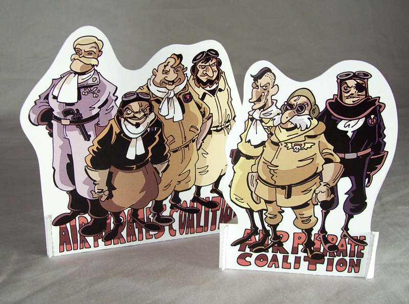
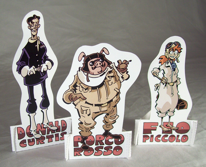
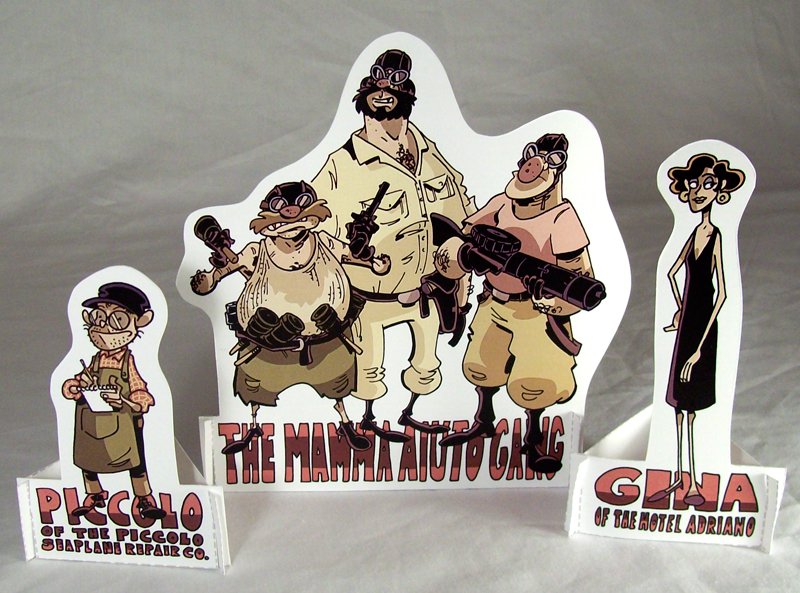
PORCO ROSSO Paper Figure Set

(Click here to download the print file)


(click the images for full-sized versions)

When it comes to Miyazaki movies, everyone has a different favorite.  Mine is Porco Rosso, the story of a former WWI flying ace who takes up bounty hunting amidst seaplane pirates in the Adriatic Sea in the 1920s.  Oh, and he's been turned into a pig, because it's a Miyazaki movie.  I mean, really, what else could you want?


I'm always surprised at the number of folks who haven't seen this one, even though they may love other Ghibli films.  Well, consider this an invitation to get to it, friends!
So, print these out and assemble 'em yourselves.  Play with them.  Put them on your desk at work.  Give them to a child whose love of animation, anthropomorphism, or aviation you want to foster.  The print file download is, of course, free.


Also, feel free to check out the OTHER PAPER FIGURE SETS I'VE MADE.  I'll be putting a new one up every Monday for the rest of 2012.
And to keep in the giveaway spirit of last week's post, any tumblr reblogs will be entered to win a prize: TWO professionally printed copies of the Porco Rosso figure set (one for you and one to give to a friend).  Reblogs only... "likes" don't count towards the giveaway, though they are appreciated.  The winner will be announced October 8th.  You don't have to follow me to win, but be sure to check back if you're not following to see if there are prize updates.


Enjoy!

Saturday, September 22, 2012

What's the Point of a Comic Shop?

I took my daughter to one of my local comic shops today.  We have a few, but it’s my favorite for a few of reasons:

• They have a really good selection of comics in general, but they have a big strip reprint section, which is usually a good indicator of the variety a store will have

• They have a pretty impressive kids’ comic section, and it’s right in the front of the store.  I consider this hugely important in a comic shop.  There’s another shop in my area with a great selection, but the very first thing you pass walking in is a dvd rental area with lots of superhero and anime porn.  Hardly a setup that invites any but the most dedicated readers, and a real turn-off to parents.  I know I wouldn’t bring MY daughter into that one, though I’ll shop there myself.

• The staff has always been AMAZING.  Well-informed, extremely polite and friendly, and eager to recommend new titles based on what you like.

Whenever I take my daughter to this shop, it’s a big event for us.  I get her excited about it in the morning, and we talk about it all day.  We go over the behavior that’s expected of her (not picking anything up without permission or help from an adult, being quiet, that sort of thing) and the things that we can expect to see.  She’s not yet three years old, and going to the comic shop is one of her favorite things that we do together.  Generally, we go about once a month.

I was behind on my purchases, so I had (for me) a pretty big stack of floppies – The Creep #0 and #1, the most recent five issues of Lobster Johnson, and Rocketeer #2.  I told Penny that she could pick out a toy and a book.  She chose a plush of Smiley Bone (she already has a Fone Bone, and really liked Smiley’s vest) and the first volume of the new Fantagraphics Carl Barks collection, which I’d been meaning to pick up myself.  One of the store’s staff helped me find a couple of the floppies, and was as helpful and friendly as he always is.

We weren’t yet finished shopping, but Penny asked if we could look at her Donald Duck book.  We squatted down in the kids’ section and she rested on my knee, and I started reading her the first few pages of the "Bombie the Zombie" story.  She was captivated.  She loves being read to, and this was another part of the comic shop experience with her that I always love. That the store itself and reading are so intertwined.  That she'll remember the first time she was introduced to a character or a story, and associate it with a shop.  What could foster a love of comic shops more than that?

We were interrupted by an employee whom I’d not ever met before.  “Excuse me,” she said.  “Are you planning on buying that?  Because we don’t want people reading the stories if they’re not going to buy them.”

I was taken aback.  “Yes, I’m planning on buying it,” I said.  She turned and walked off.

I took a moment to reflect on what had just happened.  I was clearly upset by the experience, and it must have shown on my face or in my body language, because my daughter hugged me and said “it’s okay, Daddy, don’t be sad.”

We walked around the store and put back our (thus far) seventy-something dollars worth of merchandise, and before leaving I told the employee that I would henceforth be taking my business elsewhere, as I strongly disagreed with the policy, as I considered it antithetic to the whole experience of going to a comic shop. 

“I’m sorry you feel that way,” she said,  “but we’ve had people read whole issues before and not buy them.”

OF COURSE YOU HAVE.  YOU’RE A COMIC BOOK SHOP.

It’s far cheaper to buy trades and graphic novels on Amazon, and to get floppies through companies like DCBS.  So why even go to a comic shop, if doing so is not the cheapest option?

One of the reasons that people go to bookstores of any stripe – and I include comic shops in this equation – is that they have the opportunity to peruse the books that they might buy before doing so.  I often read the first chapter of a book or GN before picking it up, especially if I’m unfamiliar with it.  And, in the past (especially when I was in college) I would read entire books at Borders and not buy them.  But you know what?  Despite those occurrences, Borders ended up with hundreds of my dollars each year.  The kids that would sit and read manga in the aisles?  They also BOUGHT manga.  Part of the joy of going to a store that sells reading material is the freedom to consume the goods, provided that you are careful to keep the book/comic in the same shape as when you pulled it from the shelf.  Take that away, and you take away the ONLY tangible benefit that a shop offers over mail-order service (one COULD argue the social considerations, but the shop counter’s monopoly on comic book discussions is one that, like its former monopoly on the products that it sells, died with the internet).

This shop doesn’t offer me a discount (I’ve never asked), as do others in town.  A truly wonderful store in another city gives me a discount of fifty percent (or cost, if cost is more, as is the case with IDW) and mails things my way.  I can get books on Amazon for much cheaper than I can find at this store.  And yet I still come to this shop.  I get floppies there.  I get books there.  I get toys for my daughter, and I even pick up the odd big-ticket item (an IDW artist edition, for example).  Why?  Because I like to support my local shop, and this one is the closest one to my house, and therefore the most “local.”  I love comic shops, and I want them to succeed, and so whenever possible I make sure that they’re the ones who get my business. 

But being made to feel guilty over reading books in the store?  That drives away readers.  A kid dropped off by his mom while she’s running errands is probably much more likely to catch ire than an adult customer with a stack of books waiting at the counter, so if I get that sort of individual attention then I can be SURE that the kid does.  If that kid is made to feel unwelcome, then he or she will be far less likely to grow into a habitual customer.  That kid may leave off comics entirely.  It’s poor business and extremely poor stewardship of our industry, and so from now on I'm going to be making my purchases at other shops.  Luckily, I'm in a city, and have that option.  I can still support comic shops while avoiding this one.  But unluckily for any comic shop proprietors, not everyone feels a moral requirement to support shops, and EVERYONE now has the option to take their business elsewhere.  The internet, the discount comic services, they've killed the monopoly.  Make your customers feel unwelcome, and they'll leave.  They have that option, and it's not an either/or choice anymore: they can STILL GET THEIR COMICS.  They don't need you.  You need THEM.

In a perfect world, I'd have chosen to think that this was just the (I assume) new employee acting on her own inclinations, but in truth I’d actually heard of it happening there before: another dad who’d decided to take his business elsewhere for the exact same reason (though in his case, they’d confronted the kid directly).  Every employee I'd ever dealt with there had been a dream, so wrote his story off as a fluke, or a mistake, though it seems like it is store policy after all.  That’s a shame, because otherwise it’s the best comic shop our city has got.  But I guess it doesn’t offer anything that I couldn't get from Amazon.
A couple of CROGAN commissions: First up, a couple of characters from an upcoming book (VERY upcoming... probably 2016 or 2017, and tentatively titled Crogan's Wings) Second, a picture of Catfoot Crogan, circa 1718ish. Both illustrate some changes in my approaches to drawing that I'll go into more detail with in a future post.

Monday, September 17, 2012

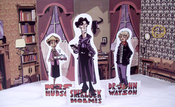
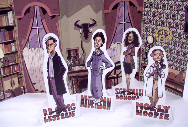
SHERLOCK Paper Figures

So I’ve been making these paper figures for myself for a while (they’re lining the walls of my studio), and I thought I’d make them available to everyone else. For free. Every Monday. Print the figures out yourself on your own printer, or you can take them to your local print shop (that’s what I do) for the best quality.


I figured I’d start with a set of figures from the BBC show SHERLOCK. If you're one of the few folks who haven't seen it yet, do yourself a favor and fix that!


I don’t usually do backgrounds, but this set comes with a Baker Street diorama, because come on, Baker Street.


Anyway, click here to download the print file. It's a little shy of 27MB, which isn't HUGE, but it probably better suited to a laptop or a desktop than a phone. If you want to get OTHER paper figure sets, just go to the paper figure page at CroganAdventures.com and pick out the set(s) you want.

Also, keep in mind that I'm doing a big


on tumblr. You can read the details here, but know that one of the prizes is a free paper figure commission. I know, I know... you may not be ON tumblr. I'm sorry, if that's the case! You can always sign up - it's free - if you want to enter this contest.

Anyway, enjoy the figures, and check back each Monday!

As always, collectors can find the original art for this and other things on my original art page.

Thursday, September 13, 2012

Three-Plane Composition


Remember how, when I posted that guide to spotting tangents, I said that lesson two would be coming in a few days? Well, that was last October. Sorry. I've been REALLY busy.

Anyway, here’s a second lesson, one on three-plane composition.

If you’ve ever taken an art class, and likely if you’ve read any books on drawing, you’ve heard the term three-plane composition. If you haven’t, don’t worry! That’s what this post is for. For you folks who know it well, consider this a refresher.

The three planes are foreground (closest to the audience), midground (not really a word, but it should be, because “middle ground” is clunky and makes you think of ideological compromise, which ain't necessarily a bad thing but has no place here), and background, which is, well, the background. Farthest away. But it’s one thing to know what these things are, and another to understand why they work the way they do, how to use them and how to avoid problems when attempting to do so.


Think of it kind of like a diorama. ‘Cause that’s really what your image is, a diorama that you’re drawing. The frame of the image, be it a panel border or screen dimensions, is the box, and the stuff inside is the drawing. Each of these areas is called a “plane,” so you have a foreground plane, a midground plane, and a background plane. Anything that exists in the dimensional space of a given plane is considered part of that plane, so if there’s a guy driving a car in the midground then that guy is considered part of the midground, as is the car, and any other objects roughly the same distance from the reader.

Okay, so let’s look at this image.


It’s one guy standing close to the reader (or viewer, for you animators) in the foreground, another guy a bit farther away in the mnidground, and then, some distance behind him, a house in the background. Right?

Wrong. There’s absolutely nothing in the first image that precludes the possibility of the second. Why is that?

OVERLAP.

Whenever an object is closer to us (“us” being the reader) than objects on another plane, it needs to partially obscure those objects. It needs to OVERLAP them. This clearly indicates to the reader that one object is in front of another, and therefore nearer to the reader. If they don’t overlap, then you get situations like the big guy smashing the little guy into the tiny house, and nobody wants that.

Audiences aren’t dumb, but you never want them to have to stop and analyze an image to figure out what they’re looking at. We’re in the business of telling stories, and if your reader stops for an instant – the barest microsecond – to process what it is they’re supposed to be looking at, if their brain has to change tracks from following the narrative to interpreting an image… well, you’ve failed in your first priority, which is to tell a story and tell it clearly. Your audience will know that the bald guy isn’t giant and that the house is farther away, but by not using overlap to immediately present it as being so means that your reader might slow down for a second, and we can’t have that, no sir.


So here’s a solution, one that keeps the composition practically identical (fixes of this nature are not hard). By adding another element to the midground (in this case, a truck) and having midground guy physically interact with it, you are allowing foreground guy to overlap it. He doesn’t have to overlap midground guy, he just has to overlap SOMETHING in the midground. By having midground guy touch the truck, you’re showing that he’s on the same plane. And the bushes in front of the house? They now extend behind midground guy, making it clear that the house is in the background, because midground guy OVERLAPS it.

So why do we need three plane composition at all?

As I said, we’re in the business of telling stories. Three plane composition can make an image more visually arresting, sure, but that’s not why we do it. As storytellers, we do it because it allows us to fully engage the audience. This happens in two very important ways.


Okay, so here’s a quick sketch of a guy hacking his way through a dense jungle. The foreground plane, for your convenience, is colored dark purplish, the midground plane is sort of red, and the background plane is a light purplish.

Let’s focus on the foreground. That’s the real crux of the whole thing. You have to look PAST it in order to see the rest of the image. And that’s a really, really important thing. Looking past it forces you to engage the image.

You’re not REALLY looking past it. It’s a two dimensional image. You’re taking in the whole thing. But to your brain, you’re looking past something. You look past stuff all the time in real life. Ever take a picture in the woods and think it’s going to be beautiful, only to see it later and it’s just a big clump of green? That’s because your brain is constantly firing away, removing the visual obstacles in your path and processing that which you want to see. It can’t do that with pictures; it requires subtle movement on your part to get a three dimensional sense of what’s beyond the boring stuff. Your windshield. Unless it’s filthy, as mine often is, your mind is basically phasing it out, looking at what’s BEYOND it. And when you give your audience an image like this, that part of the brain kicks into gear, just because it’s so used to doing so. The reader doesn’t realize it, but his or her brain is working at solving a problem that isn’t there, which makes it FEEL like a challenging read, even though it’s really not. They don’t have to put forth any effort, so they’re never frustrated, but their brain is working extra, so they fell extra engaged.

That’s the unconscious part. There’s a conscious part, too. Or at least more conscious than that thing I just talked about.

By putting the foreground elements ON THE SAME PLANE AS YOUR READER, you’re making that reader a part of the image. It’s kind of like making a movie in 3D, only you didn’t have to spend millions and millions of dollars. If your audience could, were the image frame a window, reach through it and touch the foreground element, push it aside to get a better view of what’s behind it, then you’re engaging your audience by bringing the image to THEM.

It also creates spatial depth, a believable world, and all that jazz, but I think the audience engagement thing is far more interesting and discussed less frequently.

Okay, so if that’s an important role for the foreground, then it creates a RULE for the foreground, at least for me. Three distinct spatial differences does not make for a good three plane composition, not if you want that audience engagement.


The guy in the image immediately above is close, but not close enough to be on the same plane as the reader. We’re seeing this “foreground” character from a good ten feet away, and that’s too far, in my opinion, to be an effective foreground element.


There’s an AMAZINGLY well-drawn book by French artist Riff Reb, a comic adaptation of Pierre Mac Orlan’s A Bord de L’Etoile Matutine. It illustrates this point. Here’s one of the panels:


The soldier in the “foreground” is barely of a midground scale, so far as I’ve reckoned it. This means that the depth of the image is minimized, and there are few if any examples in the book in which there is a foreground element on the same planbe as the reader; most fall into this at-a-distance category. I’m not all that familiar with Riff Reb’s other work, but I believe this to be intentional, a narrative device. The book is paraphrasing a journal, and thus the tale finds its audience not through a participant but through the tale’s audience, so it is once removed from those involved by the time it reaches us. Eliminating a close foreground element whenever possible serves to amplify that effect that we as the collective reader are an outsider, NOT “in” the scene but observing it through the lens of time. While this is not something you want to do unintentionally, it goes to show that every “rule” can be broken if you’ve got a good narrative reason, and an understanding of why you’re choosing to break it and the effects that doing so will have on the reading experience.

So, if you want that foreground element to really pop, to really give your reader a chance to feel that he or she is “in” the story, make sure that it meets two criteria:

  1. The reader could touch it were the image frame (panel border or screen edge) a window (i.e. the object is on the reader’s plane of existence)
  2. The object is cropped by at least two sides of the image frame.


This second point further bolsters that sense of “looking past” and forces you to keep that object as close as possible.

That's certainly not all that can be said about three-plane composition, and I'm not really delving into the midground and background planes much, but that's because (a) I've got to leave for school in a few minutes, and (b) foreground seems to be the area with which folks have the most trouble. Hope you find this useful!

Sunday, August 26, 2012

Dragon*Con Commissions!

Well, Dragon*Con is in just a few days, and I realized that I haven't filled my commission list yet!  I don't have time for many between now and when it starts, so I'll only be taking twenty.  Here's the deal:

You get an original 5x7 piece of art (ink and watercolor) featuring one character for twenty-five dollars.  I'll do it ahead of time and you can pick it up from me at the show.  I'll be taking commissions at the show, too, but in a limited number given the time and working condition restraints, so if you want a commission, this is the best way to go about it.

Special: get five pieces for a hundred bucks.  That's a $25 dollar savings!  And great if you want, say, all four ninja turtles and April O'Neil, too.

Here are a few recent 5x7s, to give you an idea as to what yours might look like:

Game of Throne's Tyrion Lannister


The eponymous Doctor Who


Doctor Who's Amelia Pond

One of Doctor Who's Weeping Angels


My own Crogan-Junichi character


Bruce Wayne  Batman


The Rocketeer


Empire Strikes Back's Boba Fett

So!  If you're getting one, just hit the paypal button below and write a message (or shoot me an e-mail) telling me what character you'd like.  See you at Dragon*Con!


Hit the paypal button below, send me the cost, and then send me an e-mail at chris@curiousoldlibrary.com telling me the character that you want.


Friday, August 17, 2012

Crogan's Escape Pencils (page 7 and 8)

've been working on a lot of stuff, I'm just not ready to show most of it yet. But I don't want to be a COMPLETE internet hermit, so here are some pencils from the new book!

Friday, July 6, 2012

Accepting Commissions for SDCC - watercolored!

I stayed with the inestimably talented artists Brian Hurtt and Matt Kindt when we traveled to HeroesCon earlier this month, and was blown away by the watercolor commissions that they had done/were doing as a team. Well, if you're gonna steal, steal from the best, I say, so I'm going to try my hand at the same thing. The drawings are nowhere NEAR as pretty as Brian's, and the color nowhere NEAR as artfully handled as Matt, but maybe you like my drawings, and plan to be at the San Diego Comic Con in a few days time, and maybe YOU'LL want to get a commission from me. AFTER you get one from Matt and Brian, of course (if they're offering).


Here's an example of the type of pic you'd get: Han Solo! Only if you ASK for Han Solo, of course. If you asked for Krang from the Ninja Turtles and got a Han Solo instead, you'd probably be pretty miffed. I would. (sorry for the weird lines on the pic; my phone was doing something odd)

$25 bucks for a 5x7 hand drawn and watercolored character, your choice. You pick it up at the table during one of my signing times. Hit the paypal button below, send me the cost, and then send me an e-mail at chris@curiousoldlibrary.com telling me the character that you want.


I'll be taking commissions ONLY until Monday night. If you want one, order before midnight Eastern time on Mondaynight (the 9th).


Though I'll be doing whole-body images, here are a few more watercolors just to show how I'll handle the colors.

Monday, June 18, 2012

Tryon, NC on Thursday

In a few days I'll be doing a signing in TRYON, North Carolina, a lovely mountain town situated on the South Carolina border. I'm very excited about it. Why, you may ask? Well, for a few reasons.

1. I genuinely LOVE Tryon. It's the most amazing little town.

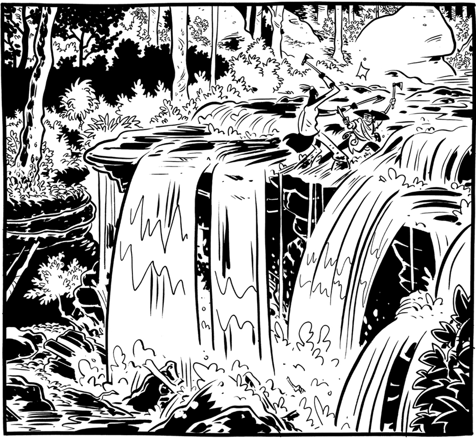
2. Tryon was essential to the completion of Crogan's Loyalty. I walked around a lot there, sketching trees and rocks and the like, in order to get the best sense of mountain foliage. I also spent a lot of time sketching at nearby Pearson's Falls in order to get a sense of the environment for the book's climax:


3. I'm doing the signing with my dad.

My parents moved to Tryon a couple of years ago, and it's through them that I became familiar with the place. My dad is mystery novelist Mark Schweizer, the author of the Liturgical Mysteries, a series of funny and engaging stories in which the police chief protagonist is also the part-time church organist and choral director. Most of the murders are church politics-related. They've won mystery awards and are staples at most mystery and Episopal bookstores.
Seeing as we operate in two fairly different literary spheres, I never really thought a joint signing would happen. But it IS happening! Both of our new books came out this week (Loyalty for me, The Treble wore Trouble for my dad), and the town's local bookstore (The Book Shelf) decided to have us both together.
I hope that, should you live somewhere in the area, you'll consider coming by. I do a big, pretty drawing in each book sold, so I'll make it worth your while...

Wednesday, June 13, 2012

HeroesCon: Map of the BEST BLOCK

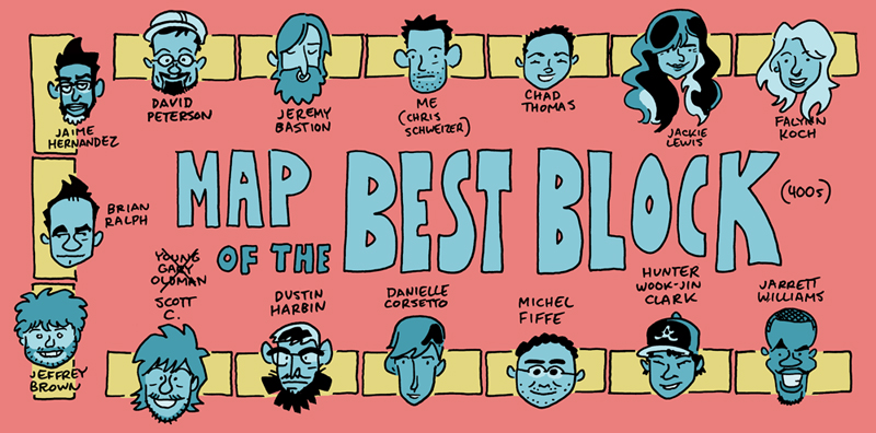
HeroesCon is a little over a week away! This is, without doubt, my favorite show, and I hope you'll get a chance to come out. Think you might have trouble finding me? Not with this lil' map:


(click for full-sized version)

That's right. We don't even need table numbers. 'Cause we're the BEST BLOCK. Anybody else think their table block is better? Well, you'd better be ready for a dance off/knife fight. 'Cause that's how the early-mid-400s roll.

In addition to getting new books, artwork, and goodies at the table, you can also see me at the following panels/workshops:

Friday at 5pm:
COMICS CANON
We discuss what comics should and shouldn't be included in a comics canon. Be prepared to be shocked at what formerly esteemed comics I throw under the bus, and my reasons for doing so! Leave convinced!

Sunday at 11am:
INCREDIBLE ALL-AGES PANEL
Jill Thompson, Roger Langdridge, Skottie Young, and Me (apparently, I'm hosting) talk about all-ages comics.

Sunday at 2:30pm:
PITCHING GRAPHIC NOVELS
"Getting a publisher interested in your graphic novel is no easy task, but with the right information you'll be in a better position to do so. Chris Schweizer "The Crogan Adventures) will go over the principles of finding the right publisher, preparing a submission packet, and avoiding the problems that cause promising books to be overlooked."

Also, Crogan stuff in the news this week:

• REALLY long and in-depth interview with COMICS REPORTER. As Jeff Parker says in a very nice post, "Set aside an hour and read it."
• Audio Interview on WAR ROCKET AJAX, the Comics Alliance podcast
• EYE ON COMICS reviews Crogan's Loyalty
• COMIC BOOKED review Crogan's Loyalty
• KLEEFELD ON COMICS reviews Crogan's Loyalty
• BACK TO BOOKS reviews Crogan's Loyalty
• Hopkinsville New Era newspaper article: Former Hopkinsville resident returns for book signing, workshop
• TV feature on a workshop I did in Indiana (NBC 14)
I also did a radio interview (WKMS), but I don't think it's been posted online. If I'm wrong, someone let me know, and I'll put up a link!