I’ve decided that this will be my last year teaching at
SCAD-Atlanta. I’m going to be
turning the entirety of my professional attention to comics and production art.
I didn’t come by the decision lightly. I love being a teacher, and I love
being a cartoonist, and in many ways each helps me be better at the other. But I’ve come to find that I can do
neither to the best of my ability without infringing on the time necessary to
see the other done to the degree of quality I’d expect of myself.
With each new round of classes I find myself spending
greater amounts of time in preparation for those classes, both in trying to
expand my own knowledge base and in preparing lectures. This prep time grows in relation with
my awareness of how little I actually know. Each new artistic principle that I learn only serves to
spotlight the many of which I may have been previously unaware and don’t yet
understand.
I’m under no illusion that I’ll ever be satisfied with what
I know. Every new discovery will
be a path to new obstacles. That’s
not a bad thing. I’m grateful that
there will always be more to learn.
But I’d like to be able to take my time a little more with those discoveries. As it is, if I stumble across an
unknown (to me) artistic principle or method or anything in that vein that I
don’t fully understand, I am obligated to work at that principle until I
understand it to the point that I can easily articulate and teach it as soon as
humanly possible. This is my
responsibility as a teacher, and as it leads me into ever-wider fields of focus
based on student career interest I find that I spend virtually all of my work
time in self-education rather than in actually producing work.
Part of my job as a cartoonist is to produce work in a
timely fashion. In my expectations
of myself, one graphic novel every two years is not a timely fashion. Sure, I do for-hire work and short
stories and the like during these stretches, but the graphic novels are the
meat of my output, and they should come out with much greater rapidity.
It has become impossible for me to exceed my current output
(or even meet it) while trying to better myself to where I can fulfill what I
believe to be the needs of my students.
And there’s the Catch-22. My entire teaching philosophy is rooted in preparing
students for the marketplace. Part
of my job as a teacher is to set an example for them. If I’m unable to make a living at comics, and to produce
comics at the rate that the market demands, I fail entirely in that job, and
have no business standing in front of a classroom. As it stands, I can’t meet my teacher obligations (as I
consider them) and my cartoonist obligations (as I consider them) both, and if
I am deficient in the latter (which I am if I’m only producing a hundred plus
pages a year) I automatically fail at the former. Therefore, if the choice between the two must be made (and
it must), then that choice must be comics.
I will still strive to improve with each project, to better
myself as an artist and as a storyteller.
But I’d like to be free of the moral obligation to make the immediacy of
that growth my foremost priority.
Learning at my leisure, through execution of work, will allow me to
create the work for which such studies have, I hope, prepared me.
Now that the decision has been made, I’m very excited. I’m anxious to get back to work on Crogan’s Escape (which has been on hold,
more or less, since the school year started), as well as preparatory work on
future Crogan Adventures stuff, which
will be where I plan to direct the majority of my attention. I have a number of presentations
prepared for school visits, and though my teaching schedule in the past has
prevented me from doing more than three or four of these a year my new, more
open schedule will permit me to visit many more schools over a much wider
geographic area. And I have other comics
projects, too, that I’m looking forward to getting off the ground. There are a number of books – mostly
kid or YA titles – that have been simmering for some time and are ready to
pitch to publishers.
And I won’t just be working on comics. I’ll be working with my good friends
Chad Thomas (MegaMan) and Jason Horn
(Ninjasaur) to start a studio in
which we’ll be doing both comics and production design. So much of what I do is done entirely
on my own, and being able to work collaboratively (truly collaboratively, from
inception to completion, rather than assembly-line style) offers us the
opportunity to work things through until they’re as close as any of us can get
to perfect. I’ve often had the
chance to work with students this way on their projects, but never as an active
participant. I couldn’t be more
excited, and couldn’t imagine folks with whom I’d rather work.
I will miss teaching more than I'll ever be able to express.
No one could have wished for more enthusiastic and dedicated students,
and no work that I create will ever give me the same pride that I feel having
had a part, however small, in the development of these incredible
storytellers. I am grateful to
have been part of a department whose foremost concern has always been to
prepare students for a career in visual storytelling (be that comics,
animation, or concept art) and to instill in them the principles necessary to do
excellent work in those fields. My
bosses have been nothing but supportive in and outside of the classroom, and
each of my colleagues have always been examples to me of excellence in both
their academic and professional capacities. It is, as I said, with great reluctance that I leave a program in the quality of which I so strongly believe.
I will, of course, continue to teach for the remainder of
the school year. The knowledge
that this will be my last opportunity to do so for the immediate future has
fired me up about making these classes the very best of which I’m capable. So, to my current students, see you in
a few days!
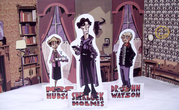
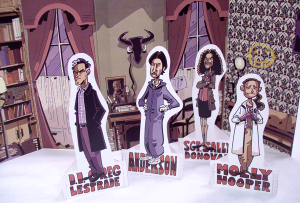
I hate to leave a post with no art, so here are a couple of redesigns for some of the Crogan endpaper/family tree characters and an attempt at refining the design of Mabel Cottonshot.

(click image for bigger view)


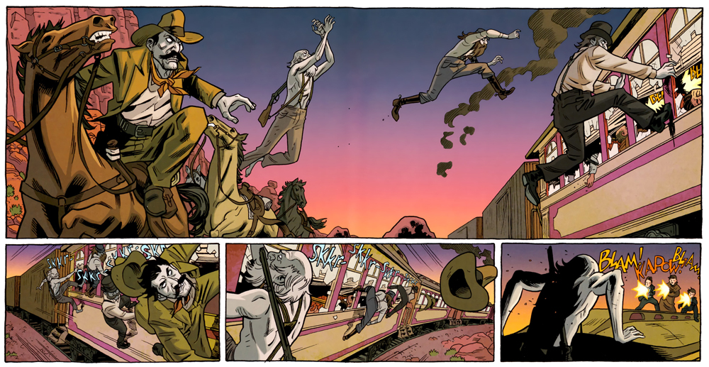


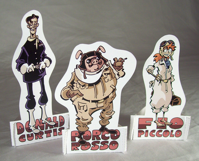
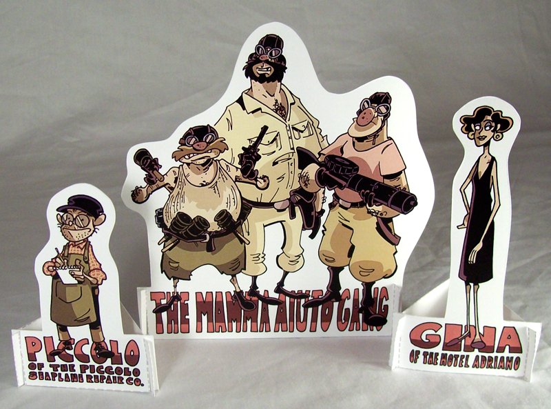
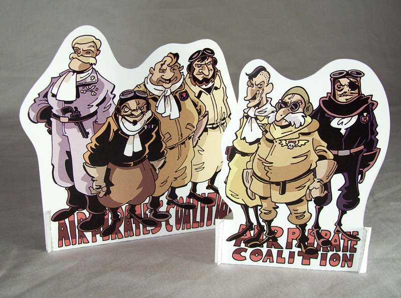
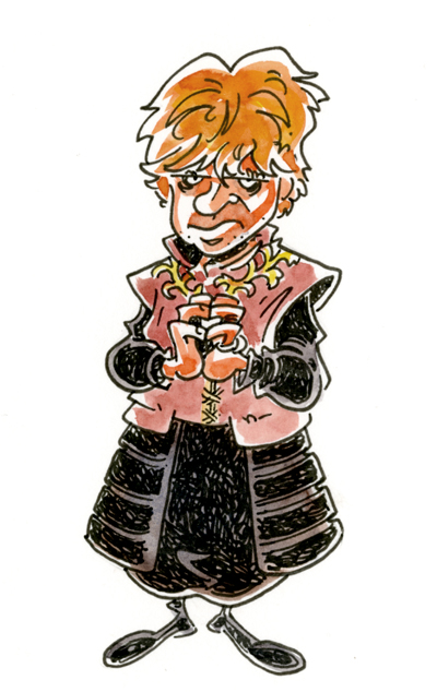
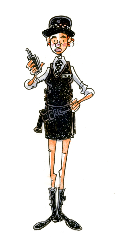
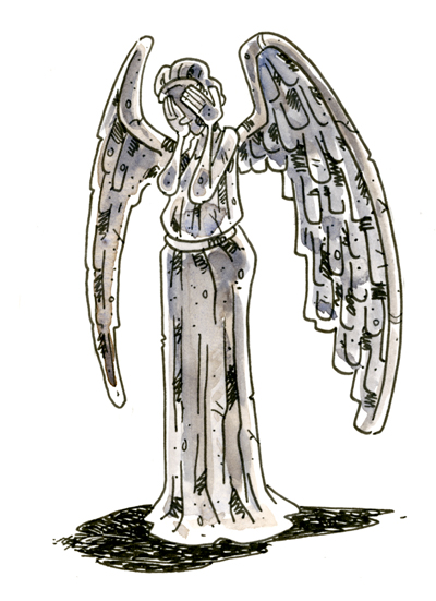
 First up, a couple of characters from an upcoming book (VERY upcoming... probably 2016 or 2017, and tentatively titled Crogan's Wings)
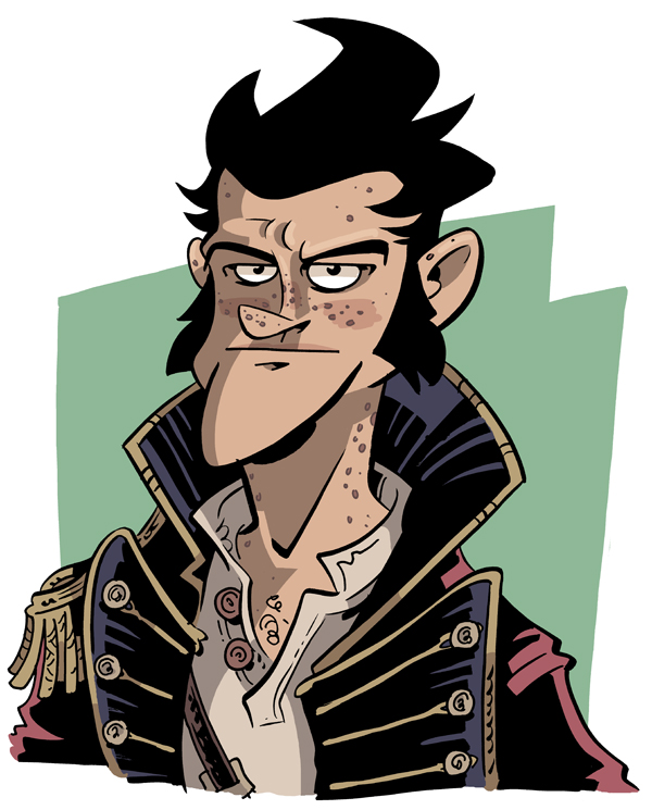
 Second, a picture of Catfoot Crogan, circa 1718ish.
Both illustrate some changes in my approaches to drawing that I'll go into more detail with in a future post.
Second, a picture of Catfoot Crogan, circa 1718ish.
Both illustrate some changes in my approaches to drawing that I'll go into more detail with in a future post.