Wednesday, July 31, 2013

Character-a-Day: Popeye

Well, I skipped the last few days' of character post-ups, because, well, I did other art.  Not today!  I'm newslettering and working on Crogan's Escape pages, so I'm going to start posting from the backlog of character drawings that I've created for such an eventuality.

Today's drawing is Popeye!  If you only know the character from the animated cartoons, you're missing out.  Popeye, who first burst onto the scene as a supporting character in the comic strip Thimble Theater 84 years ago, is one of the most entertaining characters ever created.  His comic exploits are no end of funny, and are also quite exciting.  Fantagraphics recently put out a full collection of the ten years of Popeye strips created by cartoonist E.C. Segar before his death in 1939.  I could not recommend it more highly.

My friend John Arcudi (easily one of the best writers in comics) has also repeated lambasted me for not reading the Saggendorf Popeye collection, which he contends is a worthy compliment to the Segar stuff and better than the majority of comics out there.  I intend to rectify that oversight, too, so thanks, John!

Anyway, here's my Popeye.


The Popeye in the strip didn't need spinach (that was an invention of the animated cartoon).  He was just a super hardcore foul-mouthed nearly unintelligible nautical man of principle who often found himself in jail when he wasn't brawling.  In his first adventure he's shot sixteen times and lay dying on the deck of his ship (don't worry; he made sure to punch out the guy who was shooting him first).  When Castor Oyle (Olive's Wash Tubbs-esque brother) tries to drag him below to make him comfortable, Popeye (who is, in fact, MISSING an eye) stands up, punches Castor, and, pointing at the others on the ship, defiantly insists "I've lived on deck and I'm goner die on deck," and then lies back down to die in peace (spoiler: he doesn't).  

The original art for this one is available for sale.  8.5x11," ink on 80# stock, shipped the Tuesday after purchase.  First come, first serve.
SOLD!

Tuesday, July 30, 2013

Sir Richard Francis Burton and John Hanning Speke

Burton carries a Colt 1849 Pocket Percussion Revolver, which he swore by.


155 years ago today John Hanning Speke, having left his ill exploring partner Sir Richard Francis Burton to coalesce at Lake Tanganyika (at the arrival of which Speke had been the ill one, having been rendered temporarily blind), reached and named Lake Victoria.

The tumultuous relationship between Speke and Burton is complicated and sad.  Outside of it I know little about Speke (he was a bit on the priggish side, which never bodes well for good stories), simply because Burton was such a force of nature that he dominates one's interest.  I first had my interest peaked by the man who had taken a Somali spear through the face when I was a kid reading his Book of the Sword, the first of a proposed three-volume exhaustive history of the tool throughout the world.  Being a boy with a shine for history, it was the ideal subject.

Though that was the only book of his that I read as a youngster, Burton wrote a lot.  He spoke 25 languages and could read and write another 15.  He was, at various parts of his life, an archeologist, a spy, an anthropologist, an alligator-rider, a duelist (he challenged one guy to a swordfight on his first day of college over the principle of whether or not mustaches were, in fact, awesome... they are), a diplomat, an army officer, and a notorious chronicler of sex, drugs, and whatever the 19th century equivalent of rock-and-roll might have been (probably his own translations of non-occidental erotic literature).

The original for this painting is 14"x17," and costs $145.  Shoot me an e-mail if you want to purchase it via paypal, and I'll mail it off.  chris@curiousoldlibrary.com.


Monday, July 29, 2013

TR and the River Pirates

One time when Theodore Roosevelt was a cowboy he wanted to cross a river to settle a score with a mountain lion, but his rowboat had been stolen by river pirates.  It took him more than a week to catch them, so in the meantime he read all of Tolstoy's Anna Karenina and wrote the first chapter of a biography of Thomas Hart Benton.


Thursday, July 25, 2013

Lower-Case Letters and Classroom Comics Use


Like a lot of people making comics, I find myself bridging distinct and in some ways mutually exclusive demographics.  One the one hand, the Crogan Adventures has its direct market audience, the folks who pick it up at comic shops or conventions.  These are the people with whom I most regularly interact, and with whom I have a great deal in common, because I’m as much a fan of the medium as they are, so I try to make sure that the work I do and the manner in which I go about doing it will satisfy them as much as the work of other comics creators satisfies me. 

On the other hand, I have schools.

In trying to craft a series that meets my own expectations of historical accuracy, I’ve been lucky to find that there are a number of teachers and institutions that have made use of the book for classroom purposes. 

Comics in schools are in much the same state that comics in libraries were twenty-odd years ago.  Thanks to the tireless work of cartoonists like Jeff Smith and ColleenDoran to expose their and others’ work to the library community, and to a handful of enthusiastic and courageous librarians, the reluctance of that audience to accept comics as a valid and exciting and unique form of literature has eroded away in all but the most recalcitrant arenas. 

Schoolteachers and administrators attempting to implement the use of comics now face similar opposition from their more structurally conservative factors, but they have made tremendous progress in demonstrating the incredible literacy benefits that comics offer.  Papers and articles and studies continue to be presented, and most recently the common core guidelines strongly recommended the use of comics in the classroom.  Within the next decade I would be surprised if comics aren’t a standard part of most school curriculums.  But there’s another obstacle that comics face regarding their use in a classroom setting: lettering.

I first encountered the lettering issue shortly after my first book, Crogan’s Vengeance, came out.  I was doing a workshop for a large group of teachers, and afterwards a number of them were buying copies of the book for classroom use.  I felt I’d made a good case for the benefits that comics provide, but some of the teachers, looking at the books, noted that the lettering was all in upper-case. 

Upper-case lettering in comics has been the industry standard since its inception (an inception that is under perpetual debate, though I fall into the conservative historical view that comics as we consider them began with Richard Outcault and Rudolph Dirks rather than earlier “like” comics work or the masterful experimentations of Toppfer).  The reason for this is simple enough – when lettering was all done by hand, it was MUCH easier to draw the two guidelines necessary for upper-case lettering than it was to draw the four required for upper and lower-case.

Two guidelines for upper-case; four for upper/lower

Growing up, all of the comics that I read were lettered in upper-case (I did not stumble across Tintin until college).  Even after the majority of comics began to be lettered digitally the use of all upper-case lettering continued.

So the teachers mentioned it, which surprised me.  It never really crossed my mind as being unusual.  I was told that, in literacy studies, upper and lower-case letters have consistently proven much easier to read than all upper-case. 

This has come up again and again.  Any time I speak with school groups (not children, but educators), the issue of upper-case lettering finds its way into the conversation.  And it seems to be the one factor that even books ostensibly designed for the school market regularly ignore, or choose to actively fight against.  I’ve always been a proponent of the latter.

In addition to the historical precedent, there is an aesthetic quality to upper-case lettering that I prefer.  It creates a solid block of text, which fills the white space inside a word balloon uniformly, giving it the appearance of a graphic element akin to a pattern more than a block of text, which is what it is.  One can have his or her cake and eat it to, so far as the marriage of art and writing goes.

And it is for this reason that, despite the inherent hypocrisy of regularly touting the qualities which comics have that encourage literacy development and comprehension while ignoring a factor that prevents such positive effects from reaching their full potential, I have refused to deviate from the traditional upper-case mold.

Near the end of last year I created a Crogan Adventures story for TheGraphic Textbook (this story was also included in Oni Press’s Free Comic Book Day 2013 offering).  When the story was finished, there were a handful of minor editorial alterations requested that I immediately implemented (I find that editorial acquiescence makes future work with a given editor much more likely), save for one – they wanted me to reletter the story in upper and lower-case. 


I wrote back a list of reasons for why upper-lower was not necessary.  Surely the other literacy benefits provided by the medium would more than equalize any deficiency that all uppers would create in the reading comprehension.  It’s nicer aesthetically!  A hundred plus years of comics tradition must be maintained!

Nope.

The Graphic Textbook editors would have none of it.  “This is intended specifically for classroom use,” they said (I’m paraphrasing, of course).  “Therefore it must meet the requirements of a classroom.”

And you know what?

They’re right.

The teachers whom I so eagerly applaud for how actively they champion my and others’ comics for classroom use find themselves hampered by my unwillingness to bend on this point. 

So it comes to an either-or question of priority.  Either I can continue using upper-case for its aesthetic and precedential reasons and please myself (for I doubt anyone else would care), or I can accept that upper and lower-case lettering will make it easier for teachers to justify the use of the books in a classroom setting to both themselves and anyone who might be reluctant to consider a medium only beginning to find widespread acceptance in educational circles.

The whole reason that I approach the books with the intent of making them suitable for all ages (though they are, in fact, written with adult readers in mind) is so that they might have the chance of being a gateway for some kid to discover the comics medium (plus all the history and genre stuff that I love).  I work hard to ensure that the story reads plausibly and is exciting to an adult reader, but I work twice as hard to make sure that it does so in a way that would not be objectionable to a parent who finds his or her youngster book-in-hand.  If my goal here is to allow for the chance of a wider audience, of more readers – and what’s the point of making the books if they’re not going to be read? – then it’s in my best interest, and the interest of those educators who are kind enough to consider the book a worthwhile addition to their curriculum – to use upper and lower-case.


So that’s what I’m doing.  It means teaching myself to letter again – upper and lower requires a different set of decisions and skills (does a line with no ascenders below a line with no descenders require a decrease in leading size to account for the block of white space that would otherwise accrue?), and they are skills that will likely take some time to develop.  And, in all truth, I’m pretty grouchy about the whole thing.  I don’t like it.

Yet.

Hopefully I’ll warm to it, the same way I did to recycling or not eating Hot Pockets.  I’m reluctant, but I believe that it’s the right thing to do. 

Given that some folks pay meticulous attention to changes in comics that they like (I’m one of them!), I thought it worth taking the time to explain the motivations.  I hope I’ve done so!


Tuesday, July 23, 2013

Theodore Roosevelt Watercolor

I liked how the Dennis Farina watercolor I did yesterday came out, so I thought I'd try something a little more grandiose.  It's not he sort of thing I can comfortably do without color photo reference or models, so I'm going to abandon this sort of thing for the time being, but it was a fun challenge/exercise after yesterday's writing.

T.R. (or, as we refer to him today, Teddy - a name for which he did not care - wrote a book about his experiences hunting big game called AFRICAN GAME TRAILS


If you want the original for this (it's pretty big, 14"x17") and a perfect gift for the TR lover in your life) I'm happy to put it up for sale.  I'll say $225 domestic, $250 international.  If you want it, pay via paypal by choosing "send money" and sending it to chrisschweizer@hotmail.com (not an address I use anymore, but still my paypal).

Monday, July 22, 2013

Dennis Farina, 1944-2013

Art by Chris Schweizer (watercolor)

Today we lost a wonderful actor, Dennis Farina, who brought his 18 years with the Chicago Police with him to any number of excellent cop roles, including that of Detective Fontana on Law & Order, a character who I liked more than even Lenny Briscoe (I know that's a heresy, but I don't care. I loved Farina's just-on-the-cusp-of-over-the-line/dirty portrayal). Pick up a copy of Crime Story (you can get the whole series for next to nothing); you're in for a treat.

Thursday, July 18, 2013

Character-a-Day: The Shadow

The last of the pulp characters!  At least this time around.  I'm off to San Diego tomorrow, and plan on running some other stuff during my absence.

Artwork by Chris Schweizer

The original art for this one is available for sale.  8.5x11," ink on 80# stock, shipped the Tuesday after purchase.  First come, first serve.
SOLD!

Wednesday, July 17, 2013

Character-a-Day: The Black Beetle

Today's pulp character is Francesco Francavilla's Black Beetle, the eponymous star of the new ongoing Dark Horse series.  I've been a fan of Francesco since I first saw his work on his blog, and I've been lucky enough to become friends with him over the past few years while living in Atlanta.  I couldn't be happier at the overwhelming reception that BB has received, and it's been a joyous thing to see such great art and fun subject matter get the attention that I believe it deserves.  It's also got a great villain - Labyrintho!

If you haven't read The Black Beetle yet, the issues for the first storyline - No Way Out - are all out and available (find 'em on paper OR digitally through the Dark Horse app), and you should really give it a go.  The hardcover trade collection is due out on October 29th.  I'll probably be picking mine up from Acme Comics in Greensboro, NC, while I'm there for Comic Book City Con!

This pulp hero is featured in the stories NIGHT SHIFT, NO WAY OUT, KARA BOCEK, and NECROLOGUE by Francesco Francavilla

Seriously, read this comic.

The original art for this one is available for sale.  8.5x11," ink on 80# stock, shipped the Tuesday after purchase.  First come, first serve.

SOLD!

Tuesday, July 16, 2013

Character-a-Day: Lobster Johnson

Today's pulp character is Lobster Johnson.  If you're not familiar, he's a character from the Hellboy universe.

The Lobster has been featured in Hellboy, B.P.R.D. (BPRD), and his own titles The Burning Hand, Satan Smells a Rat, The Iron Promethius, and the Satan Factory


There was a Lobster Johnson miniseries that came out right around the time that I started making comics.  I'd tried reading the first Hellboy trade a few times and while the art blew me away the pacing and shot choice decision was so antithetical to my own (one of the reasons that Mike Mignola has the reputation he's earned as a great storyteller is precisely because he doesn't go for the easy choices) that I didn't get into it.

I loved everything about the Lobster Johnson miniseries, though, especially Guy Davis' design sketches that were collected in the back.  It made me want to check out more by him, and so I started reading B.P.R.D.  Which I still contend was and is one of the best comics ever made.  From that I started reading Hellboy, and Witchfinder, and Abe Sapien, etc, etc, etc.  B.P.R.D. is the series that reluctantly got me reading floppies again, even though I don't have a place to put 'em (which is okay; they make good gifts once the trades come out), and I'm grateful for that, because there are SO many good issues these days from a variety of series.

Man, I love drawing the Lobster.

The original art for this and all the paper figures is available for sale.  8.5x11," ink on 80# stock, shipped the Tuesday after purchase.  First come, first serve.
Sold!

Monday, July 15, 2013

Character-a-Day: The Rocketeer

Today's pulp character is The Rocketeer.  I penciled about five different helmetless versions of him because really the Rocketeer is just Cliff Secord in a cool helmet, but I just couldn't get the fun and the emotional impact that comes from seeing that cool helmet, so I ended up going that route.  I also drew the comic rocket pack, even though I like the movie version more.


The Rocketeer was the first movie that I was really conscious about wanting to see well before it was out.  I counted down the days to June 21st (the release date is burned permanently into my memory), and fell in love with it.  It was a growing up moment, too - the first time I realized that a bad guy could be WAY more charismatic than a good guy (it didn't matter how well Campbell carried his role; nobody could compete with Timothy Dalton in my favorite of his many wonderful performances) and the first time that I really noticed that breasts might be worth paying attention to by way of Jennifer Connelly, a childhood crush that has remained intact throughout adulthood.

I immediately made my own rocket pack from two three-liter soda bottles duct-taped together and wrapped in aluminum foil (try it, kids!).

So I loved the movie (and a few short comics that ran in Disney Adventures), discovered the Dave Stephens comics in high school, and loved those, too.  I couldn't have been more pleased with IDW's choice for their first artists' edition, which I picked up as soon as I saw it.

So I love the movie, and I love the Stephens' comics.  But do you know what I like just as much?

The Mark Waid/Chris Samnee/Jordi Bellaire miniseries Rocketeer: Cargo of Doom, which is available in a nice hardcover with all of Samnee's pencil roughs reprinted in the back.

It's no secret that I'm nuts for Samnee's art, and I've never seen his work look better in color than it does here, with Bellaire's hard cuts.  And Waid pulls off a master storytelling stroke with the introduction of Peevy's neice, Sally.

One of the only areas of the Rocketeer that never resonated with me was the Betty stuff.  I've never found high-maintenance gals remotely attractive (since I was a kid, I've been unable to divorce looks from personality), and relationships that seem a struggle to make work from the getgo (fictitious or otherwise) seem like exercises in futility to me.  I'm in the come-on-Johnny-Rico, why-are-you-chasing-after-Denise-Richards-when-Dina-Meyer-totally-loves-you school.  What Waid does in Cargo of Doom is introduce a well-executed Betty/Veronica dynamic without it ever feeling expoitative.  By putting Betty on the relationship defensive, he makes those of us who never gave a flip care about the success of their romance, and he also gives us a viable romantic alternative, though Cliff never sees her as such (a good thing, given that the age difference would put a sheen of sleaziness on it that, to be fair, would not be out of place in the original comics).

Also, dinosaurs!  Seriously, check it out.  And if you haven't seen the movie, you're in for a treat.

The original art for this one is available for sale.  8.5x11," ink on 80# stock, shipped the Tuesday after purchase.  First come, first serve.
SOLD!

Sunday, July 14, 2013

Character-a-Day: The Ghost Who Walks

Today's pulp character is The Ghost Who Walks: The Phantom.  There are precious few iconic pulp characters that originated in the comics - the majority started in some other media and made their way over - and for this reason Lee Falk's jungle protector has a special place in my heart.  And though most of the movies made using these pulp characters have some redeeming quality or another, the Phantom movie is pretty much across-the-board awful, though it does have a pretty darn nice soundtrack by David Newman.  Worth picking up if you can track it down.

I darkened up the suit a little because I like the purple best when it gives the sense of a black panther's coat.


The original art for this one is available for sale.  8.5x11," ink on 80# stock, shipped the Tuesday after purchase.  First come, first serve.


The original art for this one is available for sale.  8.5x11," ink on 80# stock, shipped the Tuesday after purchase.  First come, first serve.
SOLD!

Saturday, July 13, 2013

Character-a-Day: Doc Savage

I was first exposed to Doc Savage as a kid, when I watched the 1975 film with my dad.  I really enjoyed it, and to this day I can't hear Sousa marches without thinking about the character.  I've since read a handful of the novels and some of the 1970s comic magazines, and really want to write an article on the influence of historical adventurer James Brooke and his band of intrepid comrades on the character, but that's an exercise for another day.


The original art for this one is available for sale.  8.5x11," ink on 80# stock, shipped the Tuesday after purchase.  First come, first serve.


The original art for this one is available for sale.  8.5x11," ink on 80# stock, shipped the Tuesday after purchase.  First come, first serve.
SOLD!

Friday, July 12, 2013

Character-a-Day: King of the Rocket Men

Today's drawing is Rocket Man, the titular hero of the 1949 Republic serial King of the Rocket Men (he wasn't really a king, as he was the only rocket man, it was just a title gimmick that Republic used at the time for a variety of its titles).  You may not be as familiar with this one as some of the others, so I'll give you the quick skinny: Jeff King was a good guy played by an actor who looks more in line with the stock bad guys of the era (big, swarthy, pencil-thin mustache, craggy features), which is kind of a nice departure from the generic doughy hero face that a lot of the serial leads had at the time.  A scientist (King's a scientist, too... everybody in this thing is a scientist) gave him a rocket pack and helmet to fight another scientist.  I watched this one because of its purported influence on The Rocketeer, and while overall it didn't knock my socks off there are a lot of cool elements to it, the best of which is the casting of the hero.  I'd kind of like to see this one revisited and playing up the fact that the hero is so against type, and maybe play him a little older, too.  Craggy scientist in his late 40s fighting an evil mastermind by wearing an impractical helmet?  There's some gold there.

An influence on Dave Stephen's pulp hero THE ROCKETEER, Rocket Man also featured in RADAR MEN FROM THE MOON and ZOMBIES OF THE STRATOSPHERE


The original art for this one is available for sale.  8.5x11," ink on 80# stock, shipped the Tuesday after purchase.  First come, first serve.
SOLD!

Thursday, July 11, 2013

Character-s-Day: Captain Midnight

I never listened to the old Captain Midnight radio shows, but I did watch some of the old serials.  I opted to try and mix the fight suit of his origins with the more superhero-esque costume that he eventually came to wear in the comics to come up with a happy medium that pays homage to both.

Captain midnight costume, a mix of the radio and serial versions and the comic version


The original art for this one is available for sale.  8.5x11," ink on 80# stock, shipped the Tuesday after purchase.  First come, first serve.


The original art for this one is available for sale.  8.5x11," ink on 80# stock, shipped the Tuesday after purchase.  First come, first serve.
SOLD!

Wednesday, July 10, 2013

Character-a-Day: 1930s Zorro

I know what you're thinking.  THAT'S NOT ZORRO!  Well, it's not Don Diego de la Vega, esteemed son of the Alcalde, but his great-grandson James Vega (a little less grandiose so far as alter-ego monickers go, true) who fights bandits intent on ruining his family's railroad interests!  Or something.  It's been a while since I've seen it, and I always get Zorro's Fighting Legion mixed up with Zorro Rides Again.  I've watched both of them on Turner Classic Movies (they're old Republic Serials), but it's been a few years.  If I'm not mistaken, the costumes are near enough identical, so even if I'm wrong so far as which one is which, it ain't the end of the world.  One of them serves as the inspiration for the Raiders of the Lost Ark horse-to-truck chase sequence.  Also, Zorro sings.  A LOT.

Zorro Rides again served as the inspiration for the truck scene in the Indiana Jones film RAIDERS OF THE LOST ARK

The original art for this one is available for sale.
SOLD!

Tuesday, July 9, 2013

Character-a-Day: 1930s pulp Batman

I'm intending to post one character drawing per day, until I forget to.  Hopefully I won't.  I have plans like this pretty often, but generally speaking am terrible about implementing them.  Anyway, I'm gonna do my best.

First up, Batman as he looked in the late 1930s.  He was a lot pulpier, and not the most pleasant of folks (it took his shooting a number of developmentally challenged wards of the state that had been giantized by a mad scientist from his autogyro to prompt editor Whitney Ellsworth to insist on Batman no longer using guns or killing people in general).  I think there's something charming about the more-literal "bat ears" of the costume, and the purple gloves, and the cape's winglike qualities.  I tried to make the utility belt look, well, utilizable.

Batman had purple gloves (gauntlets) and a utility belt clearly intended for utility, and a cape that looked like wings
I'm going to start making the black-and-white original art for these drawings available, too.  They're mostly done on 8.5x11" heavy stock paper (80#), though some (like Batman) are a few inches larger. If you want one, you can pay via the paypal link.  If more than one person pays,  the first one to have done so gets it and anyone else will get a refund.My new plan is to do the post office every Tuesday (since they're sometimes closed on Mondays for holidays).  So it'll go out the Tuesday after you buy it.


The original art for this one is available for sale.  8.5x11," ink on 80# stock, shipped the Tuesday after purchase.  First come, first serve.
SOLD!

Friday, July 5, 2013

Crogan Adventures Radio Drama #4: The Island Lost to Time

So the move is done (though the studio still has another half-day’s hard unpacking left to go) and the six weeks of pretty much nonstop travel are finished, which means I can finally get rolling on making comics!  But first, some news:

1. Since this page doesn’t have a gallery (it used to, but I got rid of it because I never changed it out), I try to keeping that which I post confined to finished art or publishable process stuff.  So I’ve joined Instagram to have a place to post while-I’m-working art, con sketches, things like that.  My user name is schweizercomics (same as my twitter), and you can get it via your mobile device OR you can get a view-only version on your computer by going to instagram.com.

2. The fourth episode of Decoder Ring Theatre’s CROGAN ADVENTURES RADIO DRAMAS has aired!  Actually, it aired a couple of weeks ago – I haven’t had the chance to post about it.

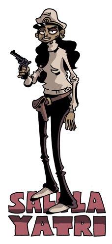
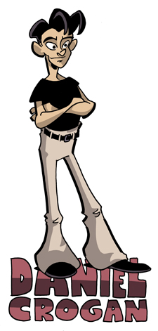
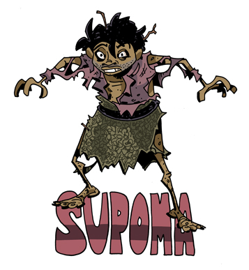
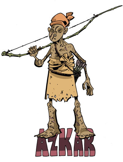
This was the story that made me want to do a radio series in the first place (there are some title card sketches from it in the sketchbook, if you look).  It’s called “The Island Lost to Time,” and filled my desire to do a Lost World/King Kong/Land that Time Forgot type of story, while keeping it historically plausible.  Tough to swing with a dinosaur island!
The story stars:
 

Andrea Lyons as Captain Salila Yatri

 
Kevin Robinson as Daniel Crogan

 
Christopher Mott as Supoma

 
Scott Emerson Moyle as S’Karno

 
Robert Westgate as Azkar
and
 
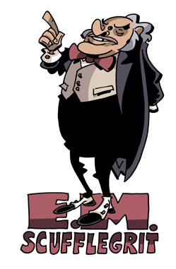
Ryan Sero as E.M. Scufflegrit

You can listen onlinedownload a copy of the show, or find it on iTunes!


It was written by me (of course) and directed by Gregg Taylor (of course)